Book Review: Presentation Zen by Garr Reynolds
Presentation Zen is a fantastic book about crafting stunning, unforgettable visuals for your next presentation. While "less is more" might be an apt one-sentence recount of the book, Reynolds has much more to offer. Below are our highlights from his work.
Tell a Story
Imagine stepping onto a stage, not with a stack of notecards, but with a powerful story waiting to unfold. That's the essence of Presentation Zen, Garr Reynolds' guide to crafting talks that resonate and stick. Forget bullet points and text-heavy slides. Reynolds advocates for simplicity and embraces visuals that evoke emotion. Consider your presentation like a captivating documentary, where each scene builds on the last, drawing your audience deeper into your message.
According to Reynolds, great design aesthetics are not enough, however. Genuine connection hinges on empathy. Step into your audience's shoes, ask yourself, "Why should they care?" and then weave in elements of persuasion and emotion. Even the most complex and novel ideas can be made "sticky" with simplicity, surprise, credibility, and a touch of emotion and storytelling.

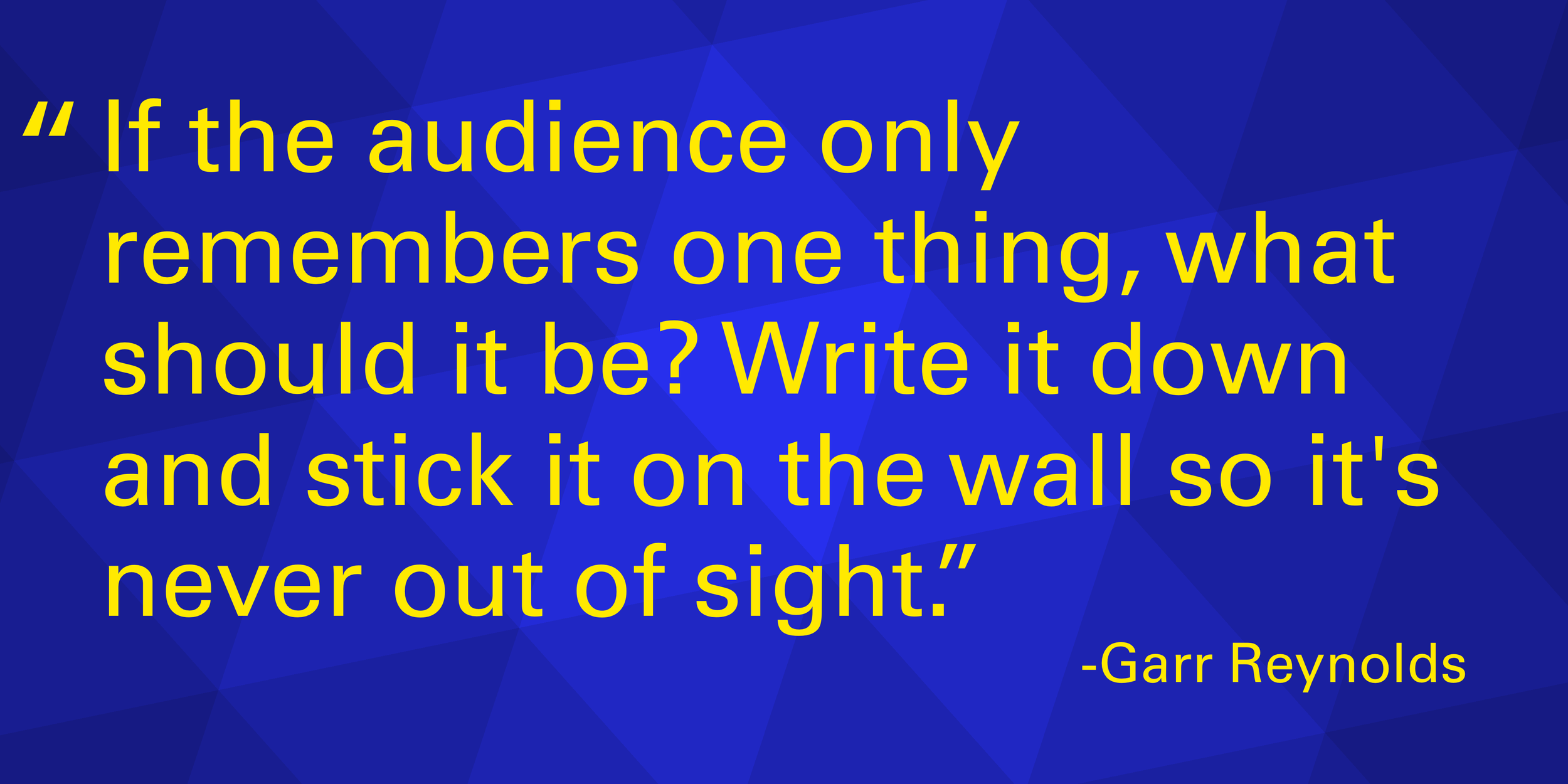
Focus on your message, whatever it may be. Everything you say and everything the audience sees should support your main point.
Edit, Refine, and Edit Again
Remember, editing is your friend – when in doubt, cut it out! Strive for Einstein's ideal: "Make everything as simple as possible, but no simpler."
We tell clients to treat the electrons on the screen like they cost money. If it costs you money, would you include that line, that extra logo, or repetitive information like the date the presentation was given? No.
Design and Align
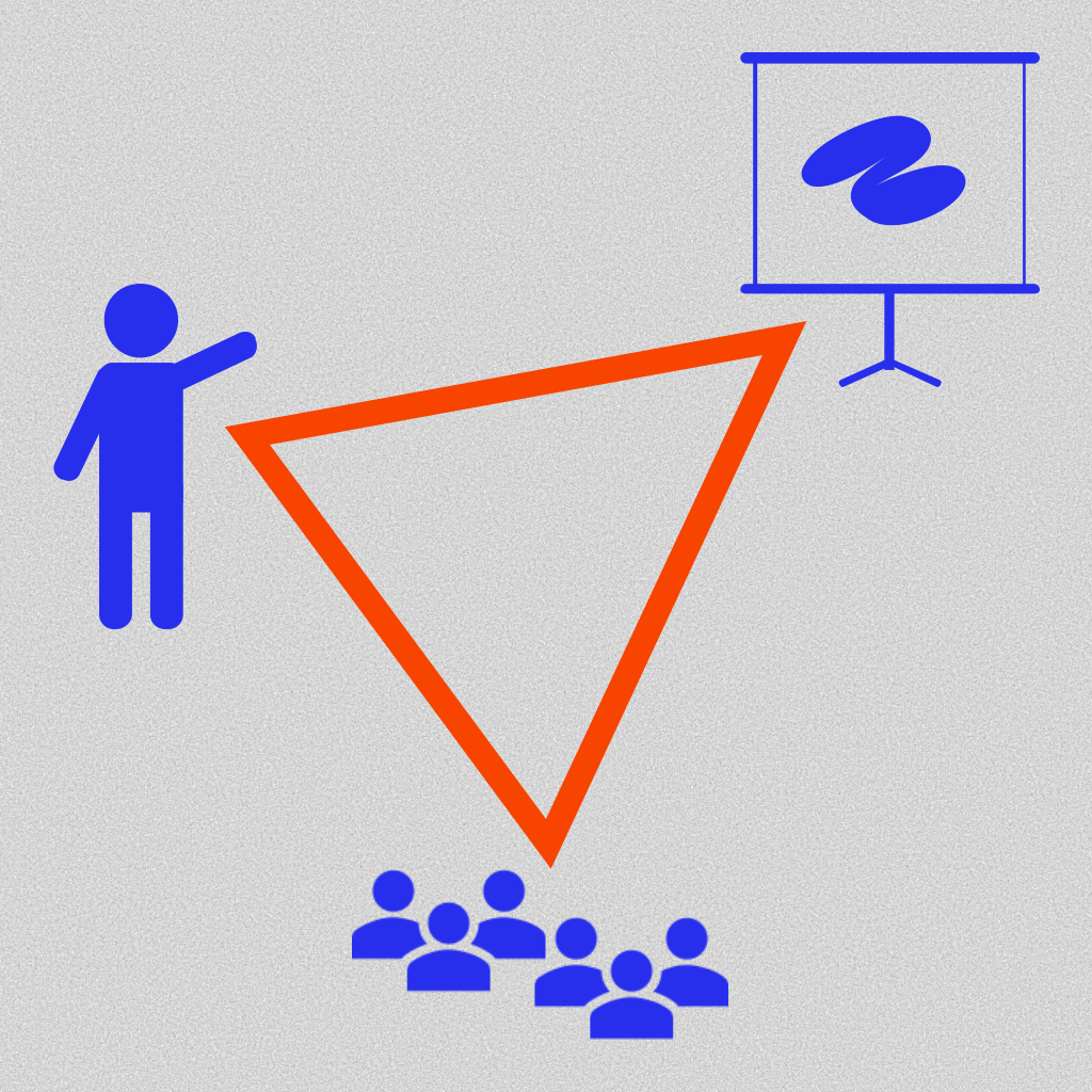
When crafting your visuals, always consider the presenter's triangle; it consists of three points: the presenter, the visuals, and the audience.

The Presenter’s Triangle
If someone in the audience spends more than four to six seconds looking at and comprehending your slide, they are not listening to what you are saying.
There is no better way to communicate than with your voice. If your audience is reading a mountain of text on your slide, they cannot hear your voice or message.
Design becomes a tool to amplify your message, not an obstacle. One of the easiest ways to ensure a uniform design in your visuals is to pick a color palette before opening PowerPoint. Once you have your palette, stick to it.
Using stock photo resources built into PowerPoint or websites can empower you to create impactful visuals. We love both Unsplash and Pixabay. You can see some visuals we have used here. Also, check out how we took a stunning portrait image and made it work in a presentation.
Using a grid to help place your visuals gives your slides a balanced look and gives your audience an unconscious sense of harmony. This structured layout improves readability by making it easier to follow the flow of information, like how a well-organized bookshelf guides your eye.
A grid also reduces clutter, preventing a chaotic appearance, and ensures a simple and clean set of visuals. Finally, grid alignment helps focus the audience's attention by creating a clear path for their eyes to navigate the critical points on your slides.
Practice Makes Perfect
A captivating presentation isn't born overnight. Like the late Steve Jobs' seemingly effortless delivery, it takes practice and preparation. Ditch the script, embrace simplicity, and let your story take flight. With Presentation Zen as your guide, you'll be well on your way to crafting presentations that inform, inspire, and leave a lasting mark on your audience.
At Bright Triangle, we fully support the concepts and techniques of Presentation Zen by Garr Reynolds.
